
UX/ UI Case Study
Project Title: Enhancing User Experience for V Locator: A 6-week UX/UI redesign project focused on research, imagination, detailed design, development collaboration, quality assurance, and launch preparation to improve app usability and aesthetics.


Synanopis:
6-week sprint, team of 3, client Vlocator
Tools:
UI/UX Lead, Storyboard Artist, and Scrum Master, overseeing design, user experience, and team coordination, facilitating communication, and creating research artifacts.
Platform:
Role:
Mobile
Timeline:
6 Weeks
Problem Statement:
Despite VLocator's inclusion of personalized recommendations and community interaction, users face usability challenges and design inconsistencies, impeding engagement. Issues like information accessibility and unclear navigation discourage community participation and hinder platform utilization.
Problem Overview:
Despite VLocator's inclusion of personalized recommendations and community interaction, users face usability challenges and design inconsistencies, impeding engagement. Issues like information accessibility and unclear navigation discourage community participation and hinder platform utilization.
Goals:
Identify and resolve usability issues.
Improve design for higher engagement.
Optimize navigation and meal ordering.
Enhance aesthetics.
Research:
Enhance VLocator app to guide users to vegan-friendly restaurants. Improve design for increased engagement, satisfaction, and longer app usage, fostering retention and adoption among plant-based diet followers.
Design Process:
User Research
User Competition Analysis
Timeline:
Color Scheme
Low Fi Wireframes
Design Tokens
High Fi Wireframes
Final Screed
Design:
User Personas
Journey Map
Analyzing F & G
MOSCOW
Discovery:
Initial Ideas
Task Flow
Card Sorting
Information Architecture
Yes, and...
Ideate:
Recollect::
Challenges
What I Learned
What can be Improved
Whats Next


Opportunities:
Enhance VLocator app to guide users to vegan-friendly restaurants. Improve design for increased engagement, satisfaction, and longer app usage, fostering retention and adoption among plant-based diet followers.
Summary:
Enhance VLocator app to guide users to vegan-friendly restaurants. Improve design for increased engagement, satisfaction, and longer app usage, fostering retention and adoption among plant-based diet followers.
Proposed UX enhancements for V Locator:
Involve streamlining, community integration, and educational resources to reengage users and stay competitive in the evolving market
Opportunities:
Enhance VLocator app to guide users to vegan-friendly restaurants. Improve design for increased engagement, satisfaction, and longer app usage, fostering retention and adoption among plant-based diet followers.
Summary:
These changes aim to reengage users and maintain competitiveness in the market.
Demographic:
Streamline app features to enhance efficiency and user experience.
Integrate community features like forums and user-generated content for increased engagement.
Develop educational resources such as articles and tutorials to empower users on their vegan journey.
Scenario: Maya, a vegan, is driving to a tech conference that is 3-hours from NYC. + She is half way into her drive when she decides that it’s time to get something to eat.
Design Phase: Storyboarding

1
Maya eagerly awaits end of work shift, tired and hungry.

2
Leaving the office, Maya unsure, opens Vegan Locator for nearby options.

3
Maya eagerly awaits end of work shift, tired and hungry.

4
Maya swiftly locates top-rated vegan eatery on Vegan Locator, utilizing its mapping feature for directions.

5
Was able to map directions and order an Uber through V locator.

6
Maya orders a vegan wet burrito, eagerly awaiting its delicious arrival. And shares an image on the Vlocator app.
Scenario:Maya discovered the benefits of veganism: health, environment, and ethics. Joining a supportive community, she thrived, learning new recipes and gaining knowledge, embracing her compassionate lifestyle with confidence and joy.
Design Phase: Storyboarding
1
Decided to become vegan!!

2
Friends and _family judged er and did not support her decision to be vegan.

3
Trying to educate herself but feeling lost.

4
Learning made easy with Vedu.

5
Engaging with the V Community at a vegan Event in Central Park.

6
Empowering others and feeling a sense of belonging. at a vegan restaurant, she found on Vlocator
Design Phase: Sketches to Mid Fidelity
I facilitated inclusive collaboration, guiding the team with "Yes, and..." and "How might we..." prompts. Mid-fi mockups enable user feedback, efficient iteration, cost-effective exploration, focusing on core functionality, early problem identification, collaboration, and risk reduction.
Initial sketches
Second round
Third round


MID FI
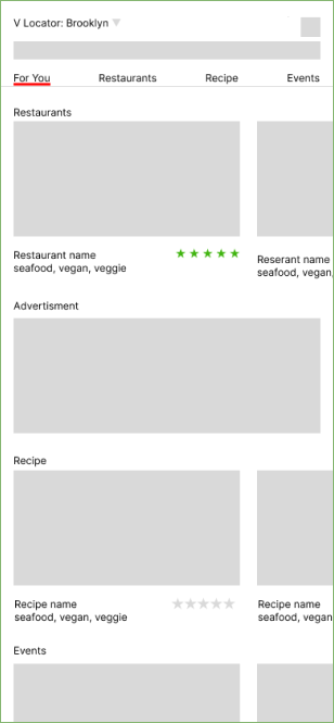
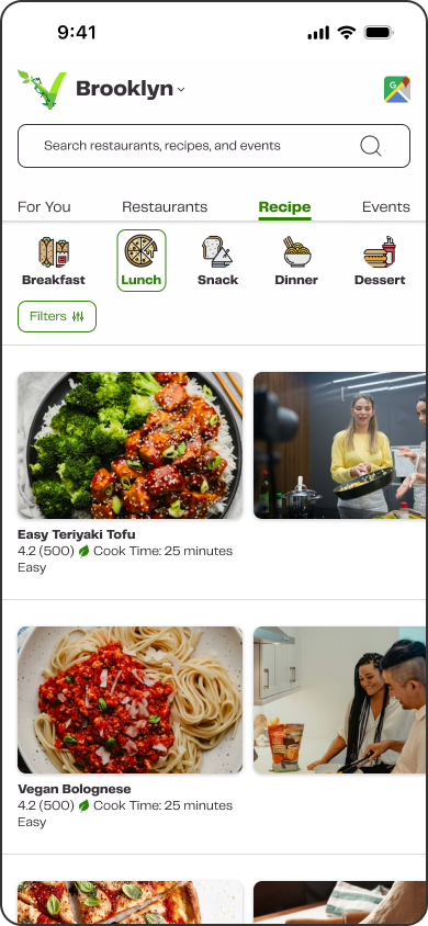
Design Phase: Updated Information Architecture
New wireframe design optimized for MVP product post-MOSCOW analysis
Retained food location feature; fixed broken links
Implemented dual navigation: permanent bottom bar (Home, V-Community, Vedu, Profile, More) and dynamic top bar
Initial "For You" page displays locator offers: find restaurants, recipes, events

Design Phase: Qualitative Data
I facilitated inclusive collaboration, guiding the team with "Yes, and..." and "How might we..." prompts. Mid-fi mockups enable user feedback, efficient iteration, cost-effective exploration, focusing on core functionality, early problem identification, collaboration, and risk reduction.
Health-conscious individuals transitioning to plant-based dietsIntegrate community features like forums and user-generated content for increased engagement.
Seeking sustainable and ethical consumption options
Valuing community support and resources
Embracing a holistic approach to health and wellness
Demographic:


Optimazations:
Clarify labeling, enhance button/icon placement
Optimize UI:
Enhance visibility:
Prominence of CTA buttons
Tooltips for unfamiliar features
Provide explanations:
Explore navigation options
Improve swipe:
Test button placements:
Prototype for intuitiveness
Design Phase: User Centric Design Thinking
Presented founder with a style guide emphasizing WCAG
Emphasized WCAG-accessible colors.
Agreed to keep current typography/logos, limited to 4 sizes.
Demonstrated commitment to inclusivity.
Aligned with accessibility guidelines.
Design Phase: Standardizing Components
Simplify user interactions through standardized design elements. Agreed to keep current typography/logos, limited to 4 sizes.
Establish consistency across UI components for seamless navigation.
Enhance efficiency and user satisfaction by streamlining UI processes.
Familiarity

Different but same

Recycle reuse

Same but a lil different

Custom for this one page but follows the design style

UX/Ui Recipe Card:
Prioritize user needs and preferences in design decisions.
Illustrate a user-centered approach through a recipe card interface. Enhance efficiency and user satisfaction by streamlining UI processes.
Illustrate a user-centered approach through a recipe card interface.

How-To Video: Watch a video demonstrating how to make the dish with captions for accessibility.
About Section: Learn about the dish, its origin, and special features.
Ingredients List: See the ingredients needed for the dish to ensure you have everything before starting.
Ingredients List: See the ingredients needed for the dish to ensure you have everything before starting.
Cooking Steps: Follow step-by-step instructions on how to prepare and cook the dish.
Other Recommendations: Explore similar dishes for alternative options.
Recommended Reviews: Read reviews selected by Vlocator as the best representation
More Reviews: Read all reviews
Global on bottom makes it easy to leave page while using industry-standard icons
Design Phase: Style Guide
Logos


Color Pallets


Typography

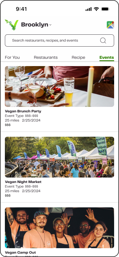
Design Phase: High-Fidelity Mockup
For You Page

Restaurant Pages
Recipe Pages
Event Pages

V-EDU Education Pages


V-EDU: Article Pages

Design Phase: High Fidelity Mockup
The V locator application boasts several accomplishments, including its cleanliness, adherence to current standards, and intuitive user experience. Leveraging founder stories, user interviews, and research, we developed a solid MVP product.
Conclusion:
Reflecting:
Reflecting on the project's constraints—a three-week timeline with a small team—I recognize areas for improvement. Enhancing my Figma skills would streamline design processes, while time limitations prevented the implementation of card support. Additionally, further testing is needed to determine the suitability of the article page within the VEDU framework.
Looking ahead:
Reflecting on the project's constraints—a three-week timeline with a small team—I recognize areas for improvement. Enhancing my Figma skills would streamline design processes, while time limitations prevented the implementation of card support. Additionally, further testing is needed to determine the suitability of the article page within the VEDU framework.
Final Thoughts:
I am immensely satisfied with the project's outcome. It surpasses expectations and stands as one of our finest achievements to date, both visually captivating and highly functional.